Balance
If you have read through all of the composition pages on this site you will have frequently seen reference to balance as part of the composition. This shouldn’t be confused with symmetry, it’s not about perfectly weighting one side of the image with the other. This is about ensuring the weight of the main topic doesn’t leave the image feeling ‘heavy’ on one side (unless of course this is intentional).
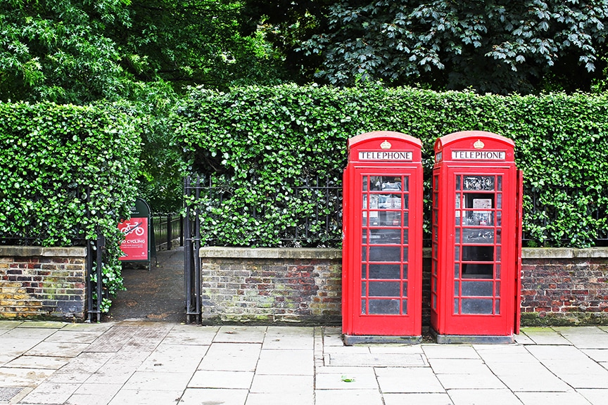
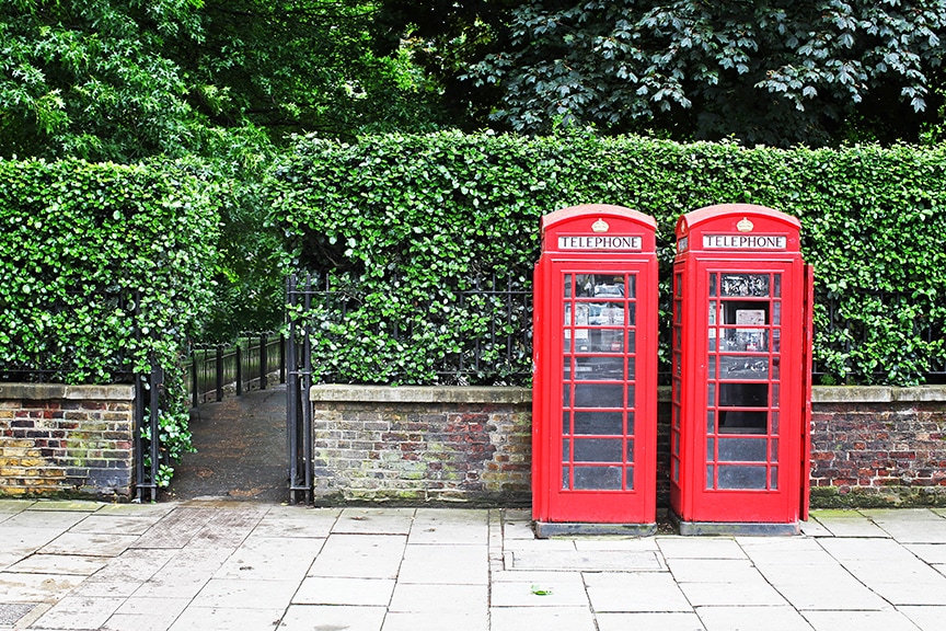
It can be quite a difficult concept to grasp in terms of understanding as it's more of a 'feeling' than anything else but it does play a very active part in determining the success or otherwise of your composition. The two images below (also seen in the Composing with colour section) provide a simple demonstration of the topic. In the first shot the small red sign provides a 'counter weight' to the very large block of colour provided by the phone boxes, in the second image without the red sign the picture appears quite different.
It can be quite a difficult concept to grasp in terms of understanding as it's more of a 'feeling' than anything else but it does play a very active part in determining the success or otherwise of your composition. The two images below (also seen in the Composing with colour section) provide a simple demonstration of the topic. In the first shot the small red sign provides a 'counter weight' to the very large block of colour provided by the phone boxes, in the second image without the red sign the picture appears quite different.
|
|
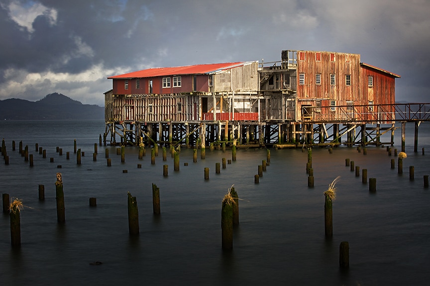
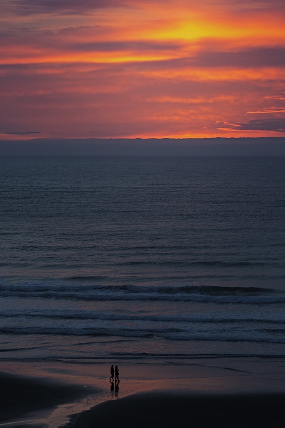
It's not better or worse, just different, but it is important to understand the difference balance makes in your imagery so you know how to direct it to make the shot you were seeking to make. In this shot of the old cannery in Astoria Oregon, the foreground is almost completely in shadow but the light is catching the grasses perched on wooden stilts in the water, these break up the darkness and provide a nice balance to the overall image.
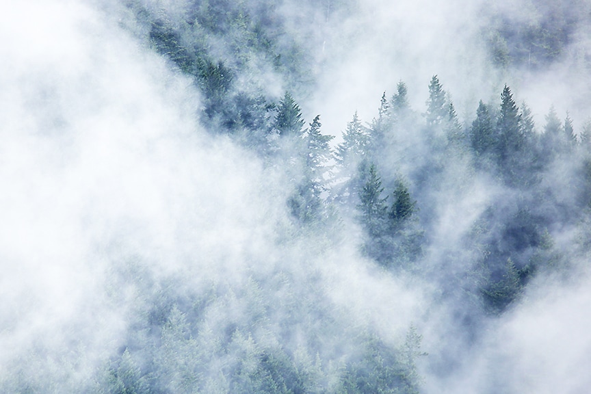
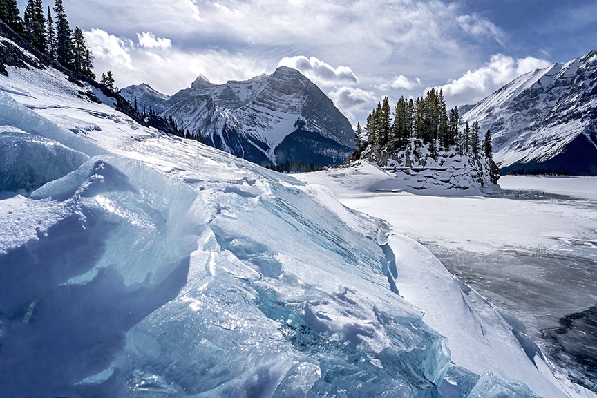
Balance in your image can be achieved in several ways, colour, light and shadow, even the perceived weight of objects. There are a number of captioned examples in the gallery below.
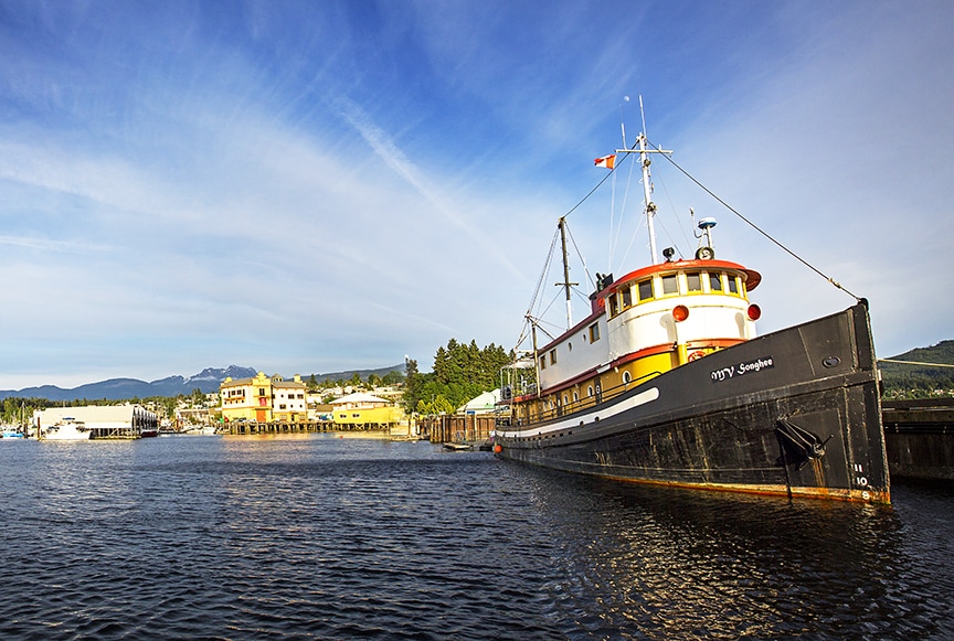
This shot in Port Alberni on Vancouver Island is heavily out of balance, the ship is placed to close to the edge of the frame resulting in additional weight, there is a heavy preponderance of yellow and other bright colours on the same side of the shot resulting in an 'all and nothing' image that has everything of interest on one side and nothing of interest on the other. It's easily fixed with a crop tool but makes for a good example of an unbalanced image.